NASCAR Insights Dashboard

A demonstration of a Power BI dashboard for NASCAR fans by Brad Allmendinger.

Back to Portfolio

Highlights

Dashboard Overview

Power BI Dashboard Preview

Features & Details

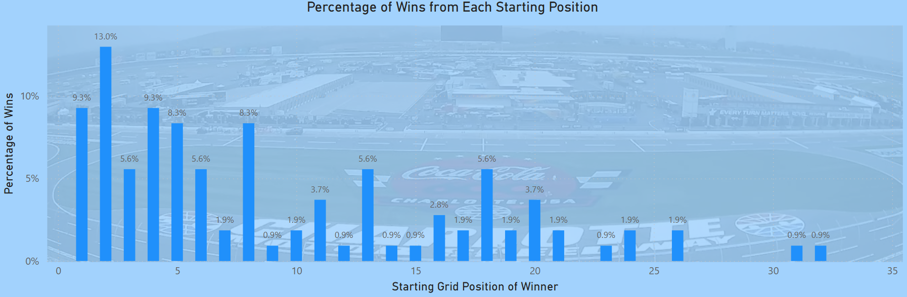
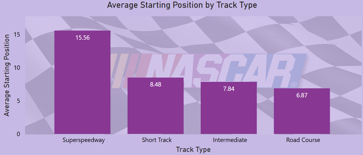
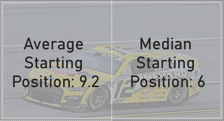
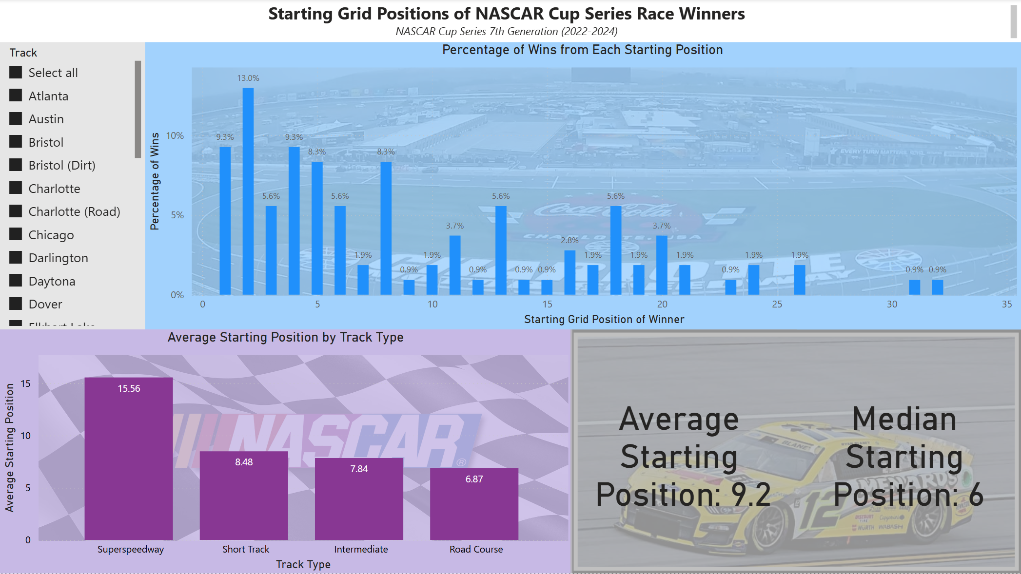
Graph: Where Winners Started on the Grid

Displays the starting position of every NASCAR Cup Series race winner since 2022. Uses a slicer to filter by race(s), allowing detailed analysis of individual events or groups of races. Helps identify trends, such as whether winners tend to start near the front or if late-starting drivers make comebacks.

Notable Insights:
  • The graph shows that starting position near the front is important but not a guarantee of winning.
  • Starting first is not the most common starting position for winners, but it does happen more often than you might think.
Power BI Dashboard Screenshot

Average Starting Position by Track Type

Breaks down the average winner's starting position across different track types:

  • Superspeedways – High variation, winners from mid-pack or deeper.
  • Short Tracks – A top 10 starting position is important for a chance at winning.
  • Intermediate Tracks – Starting in the top 5 matters more than you might think.
  • Road Courses – Track position is king! Winners start near the front, but oddly 8th is the most common starting position.
Track Type Screenshot

Highlight Cards: Average & Median Starting Position

Displays dynamically calculated Average & Median values based on selected races. The difference between the average and median is a good indicator of the distribution of starting positions. Useful for understanding whether mid-pack starters have a realistic shot at winning.

Notable Insights:
  • The median winning start position is lower than the average, showing that outliers (deep-starting winners) skew the mean upward.
  • Some tracks have an extremely low median, meaning starting near the front is critical for success.
Calculations Screenshot