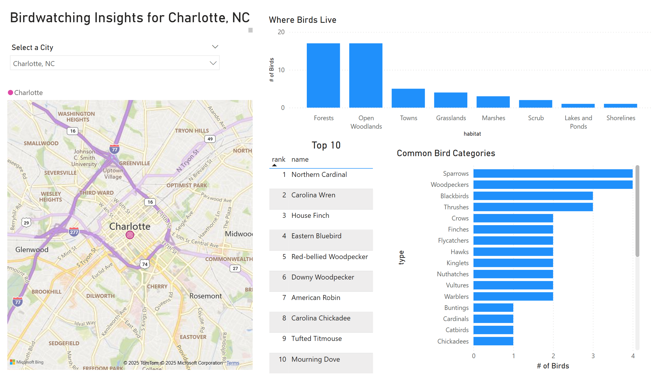
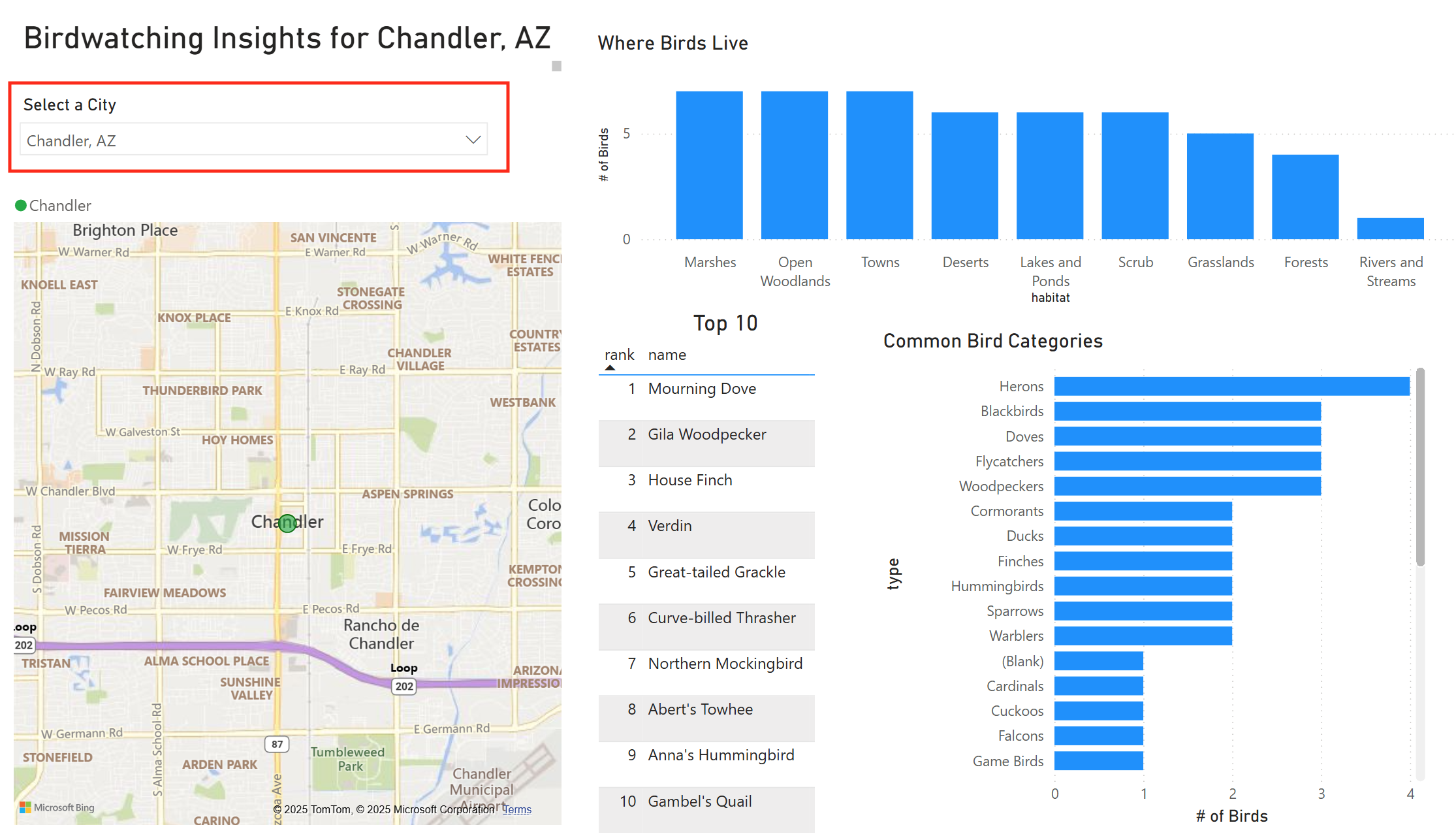
City Selection Slicer
The primary feature of the dashboard is the city selection slicer. This allows the user to select a city and see the bird data for that city.
When a city is selected, all of the features of the dashboard will update to display the data for that city. This includes the title, map, top ten list, and both charts.
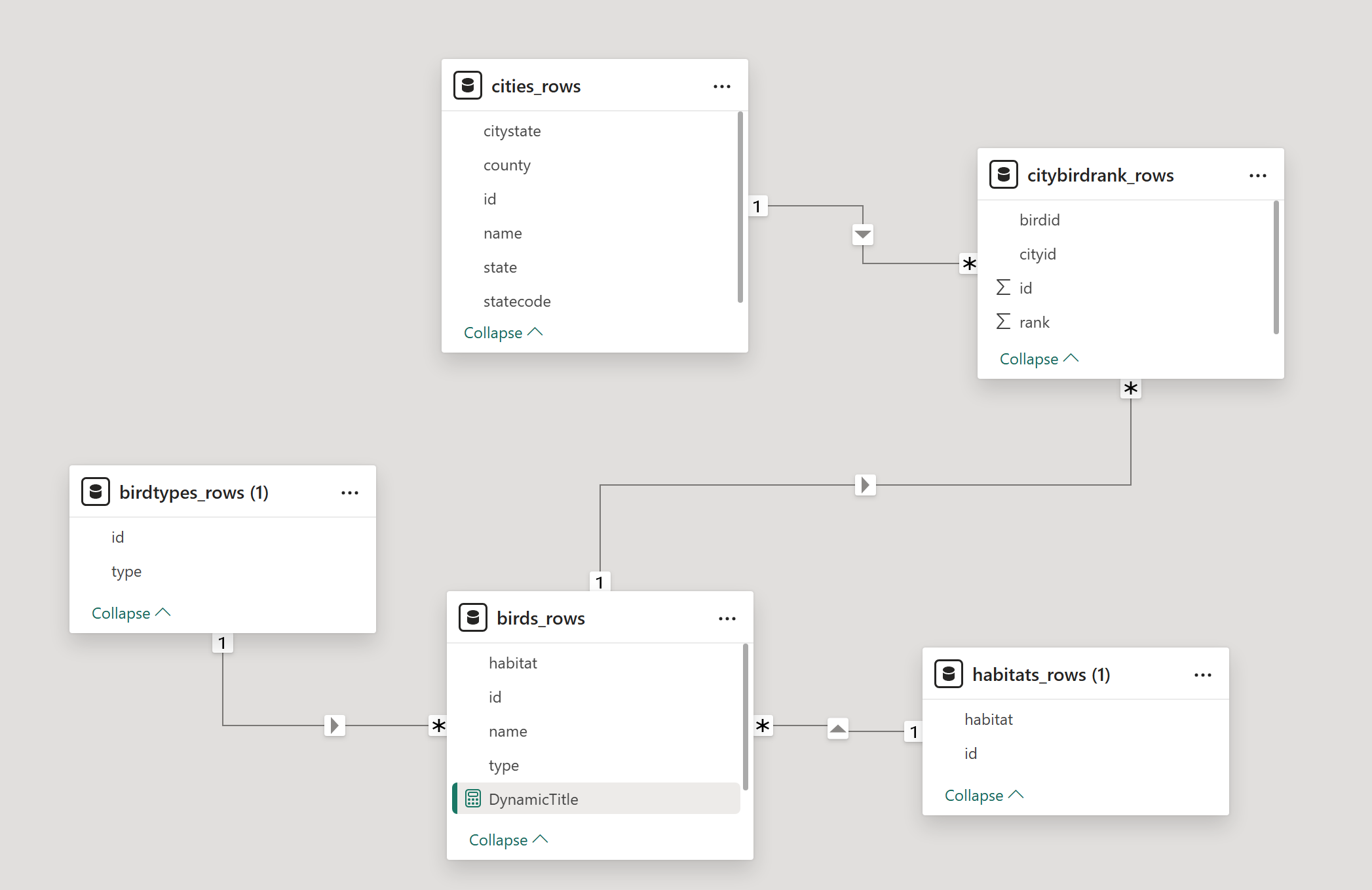
Relational Data Model
The magic of the dashboard is the relational data model. The data is stored in a star schema model, which allows for efficient reporting and analysis.
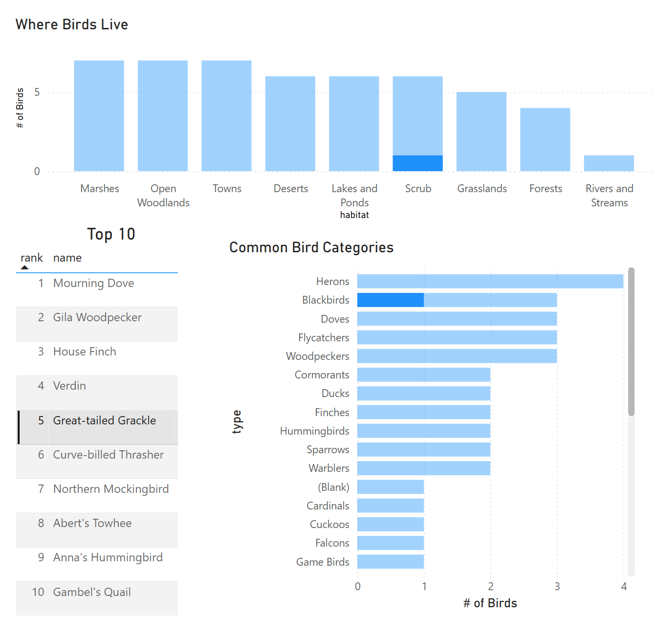
With the right connections between tables, the dashboard is dynamic and will also highlight a selected bird's type and habitat.
In the screenshot below, you can see the relationship between the tables from the Model View.
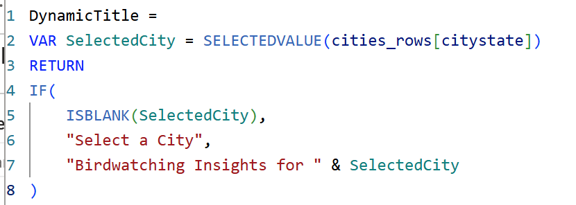
PowerQuery, DAX, and Filtering
I took advantage of PowerQuery to clean and lightly transform the data, since I created the dataset for use in a mobile app. I also used DAX to create the calculated fields and measures that power the dashboard.
The filtering is also a powerful feature of the dashboard. Although we have data for 1000 cities, only the top 100 by population are displayed in the dropdown to simplify the experience.